The image should be of high quality, well lit, on a white background that does not distract our attention. This you probably already know.
However, these are the basics without which you have no business trying your hand at eBay or Amazon.
But if you’ve already done your homework, you can learn more secrets to perfect product images for eBay and Amazon.
Amazon and eBay are different, Amazon has stricter requirements for product photos, eBay less so. Different product categories may have different specifications, different aspects should be emphasised.
However, no matter what type of products or marketplace you sell on, you can apply some universal rules. These will help you get great photos and increase your sales.
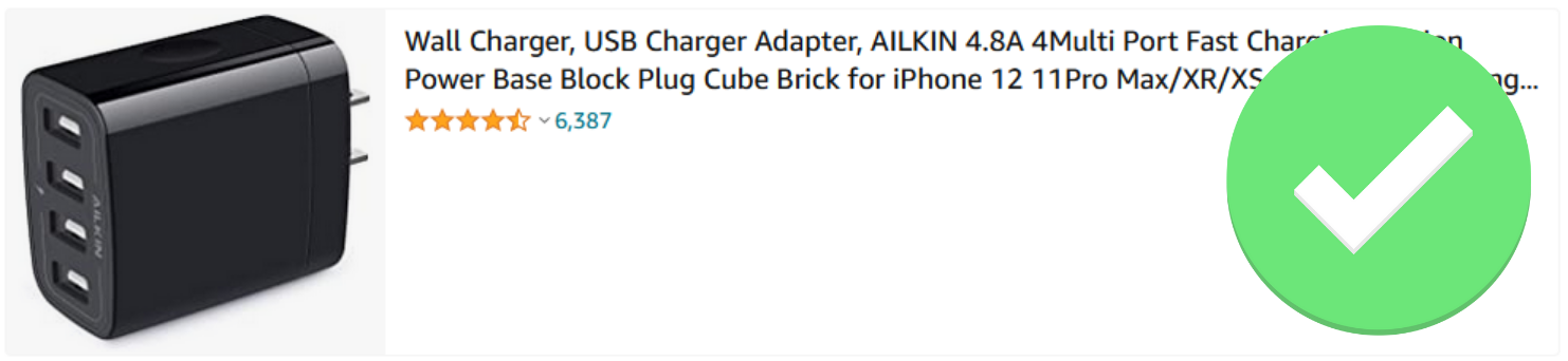
Main photo
When preparing your main image, you need to have in the back of your mind what its use is, what role it plays and where it is displayed.
Its main purpose is to show the subject of the offer so it’s clear what’s on sale, attract the user’s attention and get them to read the details of the offer, i.e. click on the listing.
Its task is NOT to present all possible product features, indicate the country of origin, highlight the brand, illustrate available variants or inform about shipping.
This information may be provided in a different way next to the image, e.g. in the title or at a later stage, i.e. on the product page.
It is worth paying attention to the appearance of search results both on a desktop and on a phone.
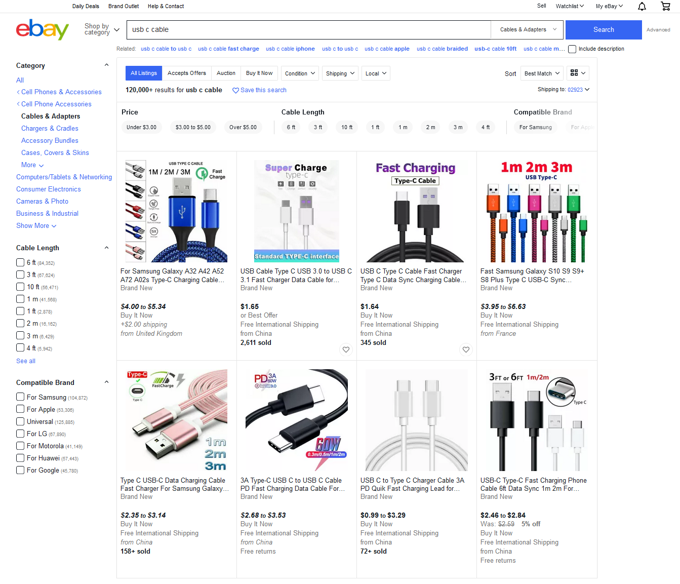

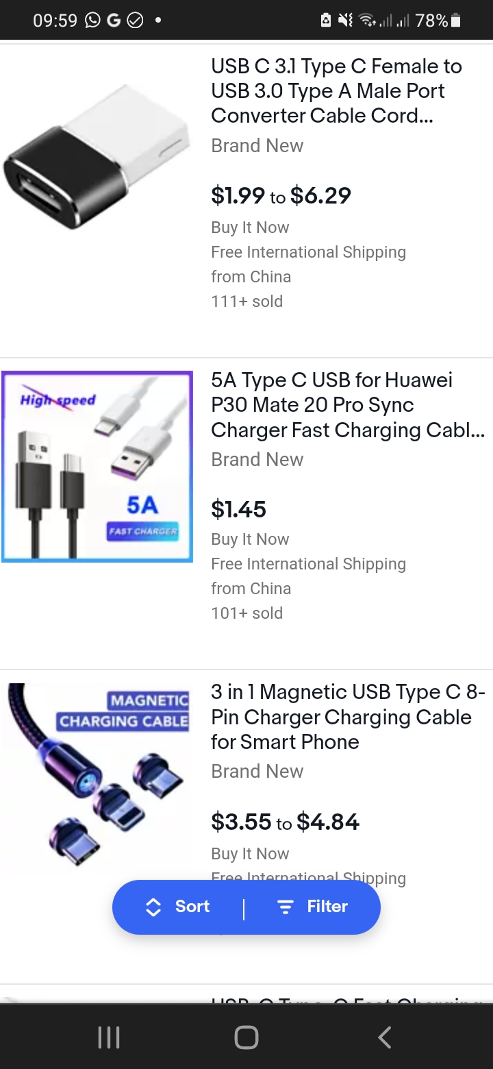
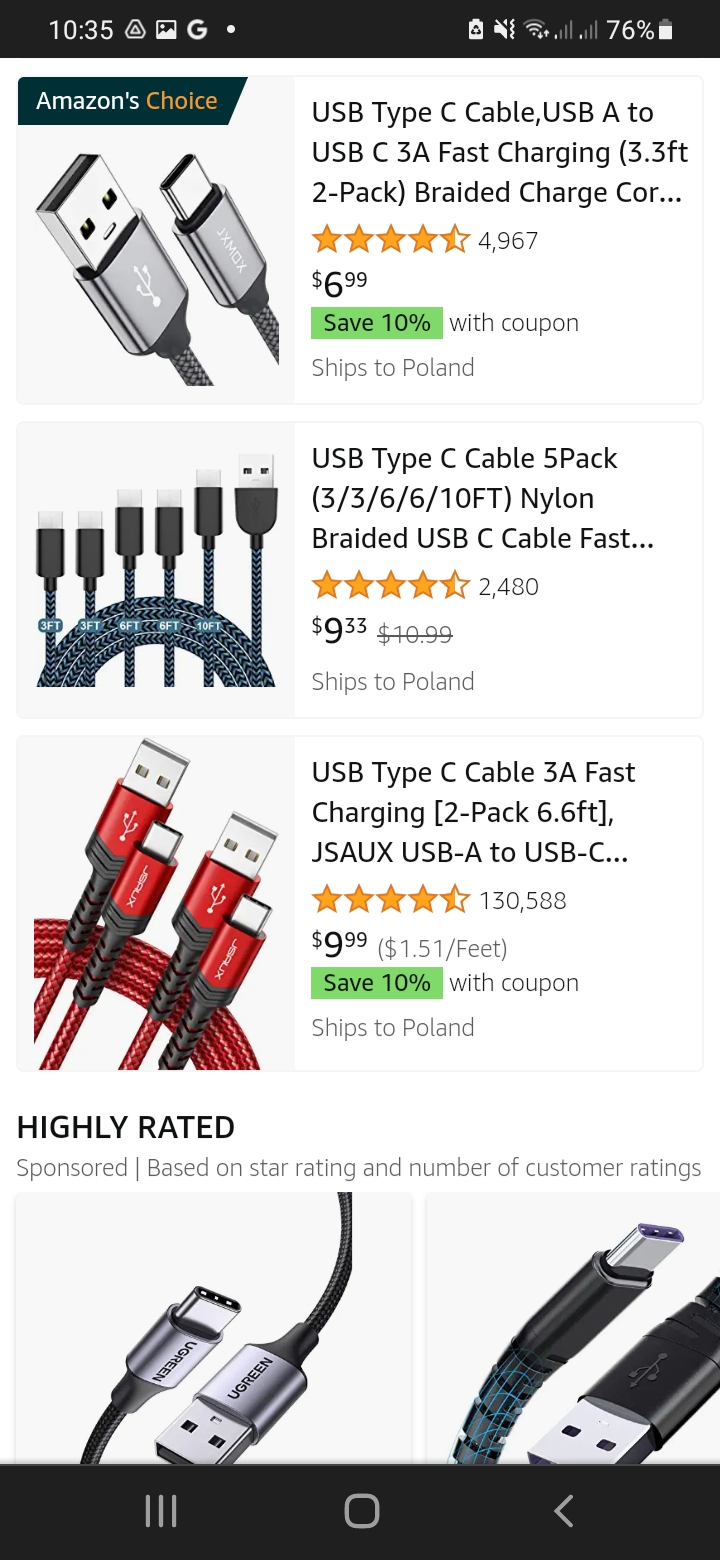
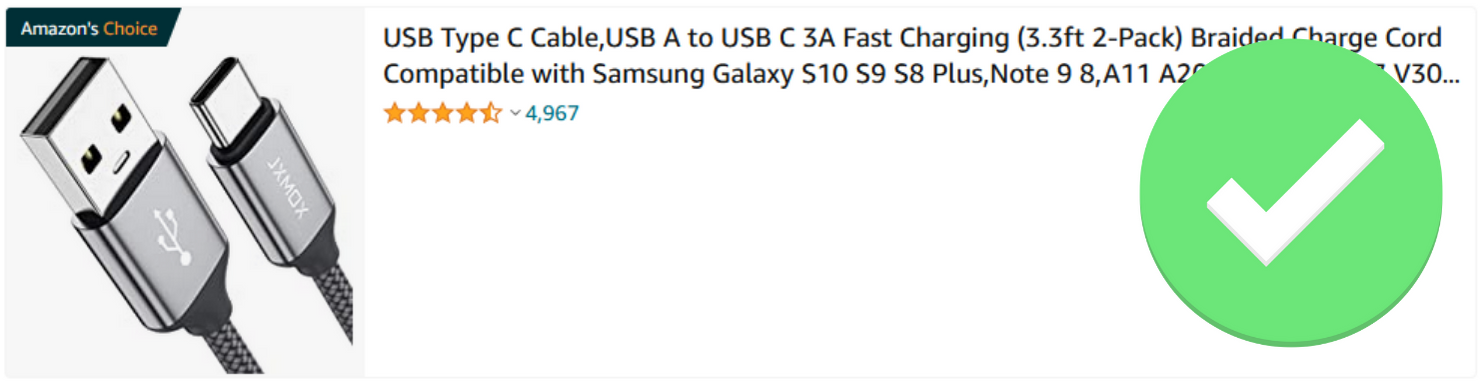
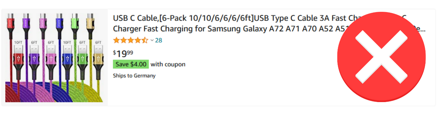
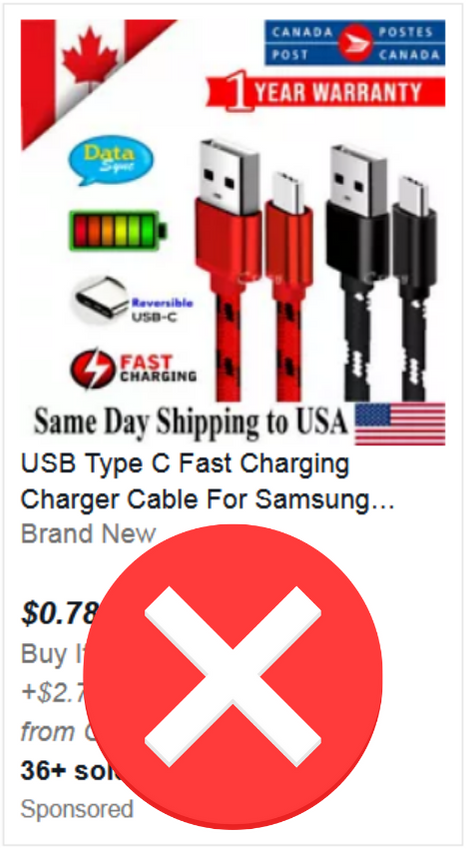
Tip 1 Focus on the product
eBay and Amazon take care to provide key information at this stage of the purchase path – including product title, price, reviews.
There’s already a lot of this information for the user to filter through, so a rule of thumb you should follow is
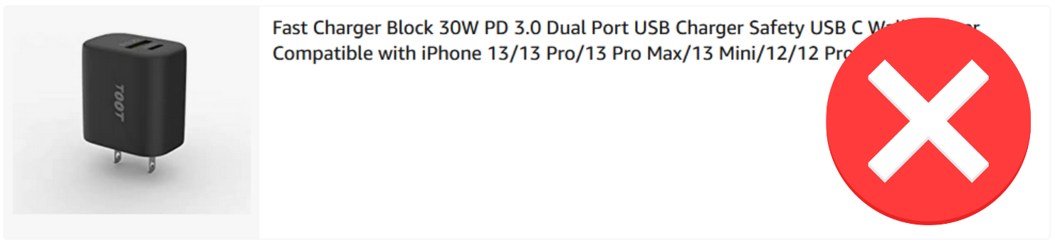
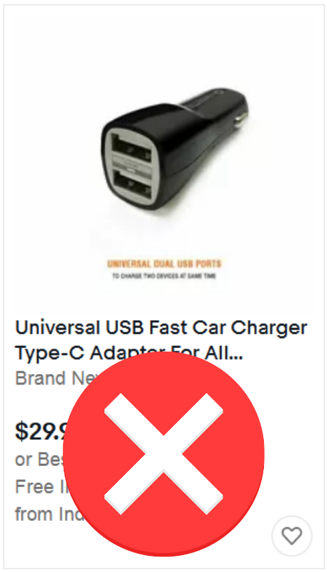
do not clutter the photo with additional elements – frames, subtitles, logotypes, pictograms, etc.
The photo should contain only the product itself. Nothing should distract the user’s attention.

When the user has a whole stack of information on the photo in front of him, browsing these offers and choosing a few interesting ones will take him much longer than it should.
If he is interested in a given brand, cable length or colour, he can filter the products according to these parameters. He does not have to look for this information in the pictures.
You may always be tempted to add some information on the main image, “because it is a super important advantage” or “because your competitors do it too”, but don’t do it. It will only make it harder for the user to buy. And because of Amazon’s strict rules, doing so could end up with your listing being removed or even your account being blocked.
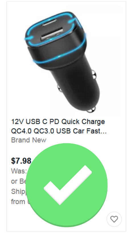
Therefore, it is better to focus on another important issue, i.e. the proportions of the product and the percentage of the image space covered by the product.
Tip 2 Use the available space
The user should already see the product correctly on the results page. For this reason, you also need to remember two image parameters – the aspect ratio and the percentage of the image area that the product occupies.
Amazon defines the exact aspect ratio of the photo, which should be 3:4. EBay prefers a more square form, so an aspect ratio of 1:1.
In the same way, Amazon defines the degree of coverage of the photo by the product – 85%. We can make the same assumption for eBay.
Following these guidelines will ensure the clarity of your photo, regardless of the device and its screen size on which the user is viewing the listings.
Obviously keep some minimum margin, but generally use the space available. Why show your product smaller when you can show it larger and in a better way for the user?
Tip 3 Stand out
If possible and the rules of the marketplace do not impose a specific presentation, try to stand out.
See what is the most common way of presentation in the category where you want to add a product and do it differently from the rest. But keep in mind the other rules – white background, whole product shown, high degree of coverage the photo with the product, no embellishments, accessories that are not part of the offer etc.
Which offers caught your eye the most?
You can do this in a number of ways. You can show the product from a different angle than the rest, you can show a different colour variant than the rest, you can display different content on the device display than the rest.
When looking for a way to be unique, don’t overdo it or you can sometimes discourage the user. Presenting a razor almost like a monster emerging from the sea abyss can look unprofessional and can put people off.
Alternative product images for eBay and Amazon
On Amazon you have 9 of them on eBay 11. Seems like a lot… but remember that with them you should show the product from every perspective and all its features, elements and functions.
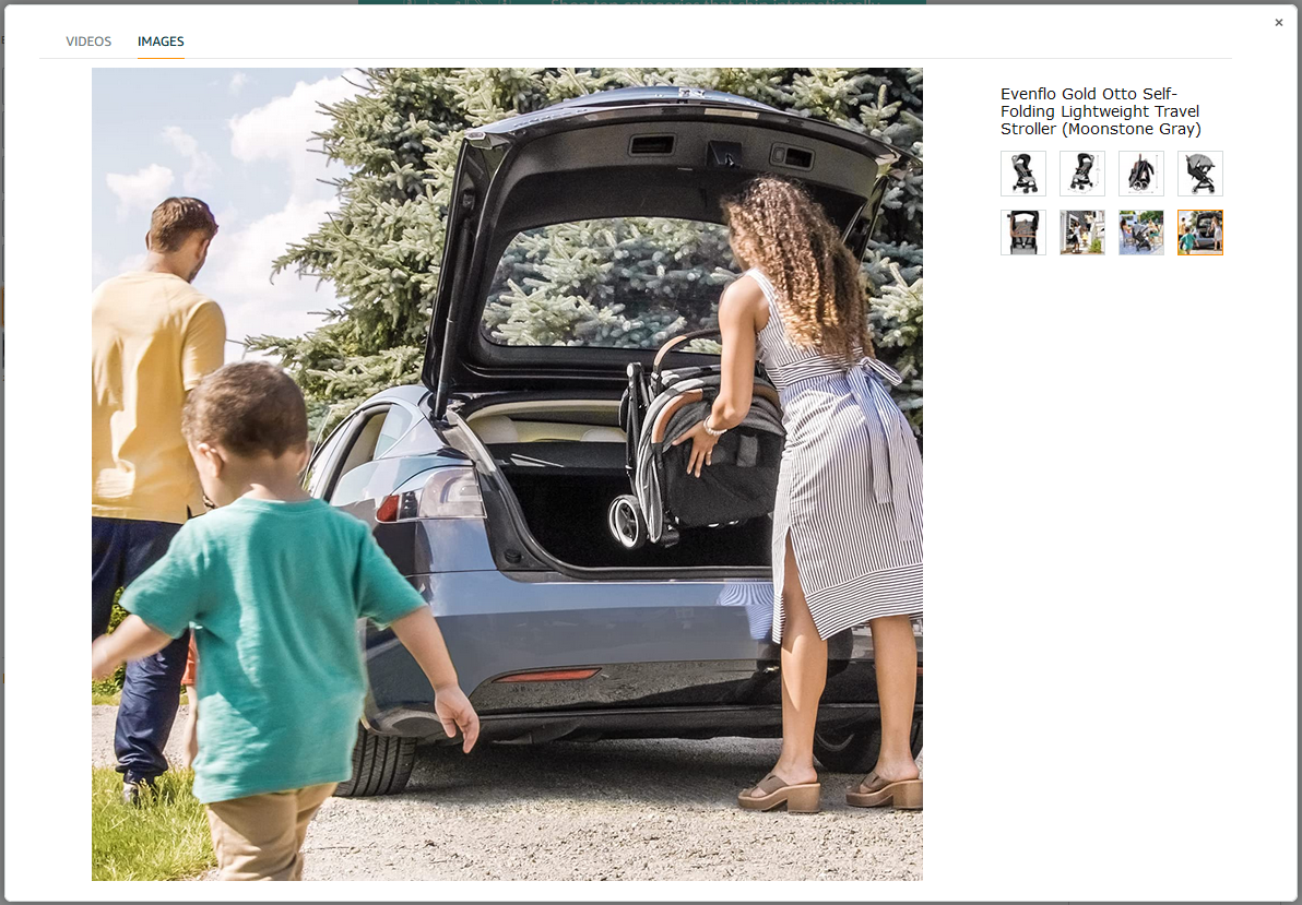
Tip 4 Show the benefit
But sometimes, instead of a specific feature, e.g. the size and weight of a baby carrier, it’s better to show that a mum can lift it in one hand and that it fits easily into the boot of a car when folded. This will be more appealing to the imagination.
Use the language of benefits, but in pictures.
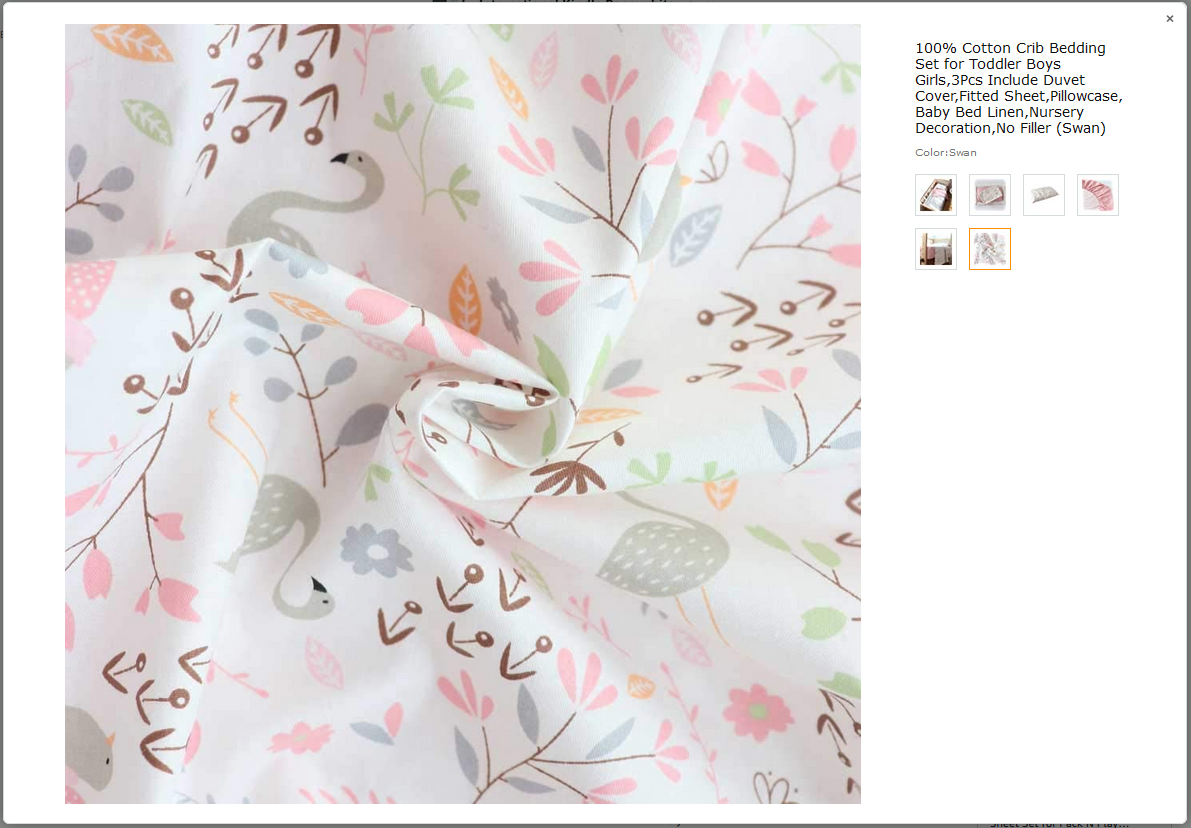
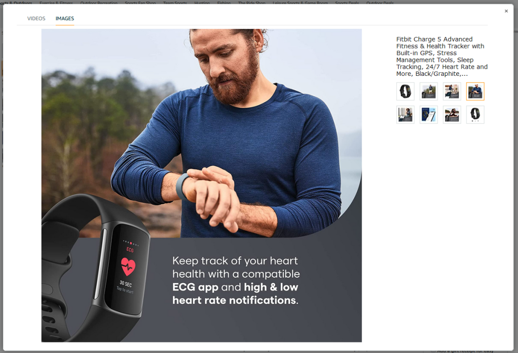
Tip 5 Show the detail
Remember that pictures added on eBay or Amazon are a substitute for real contact with the product. Since the user cannot see the product up close or touch the texture of the material, try to show it in the picture.
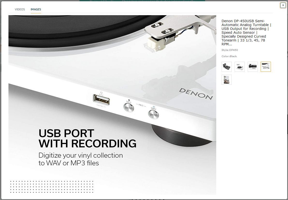
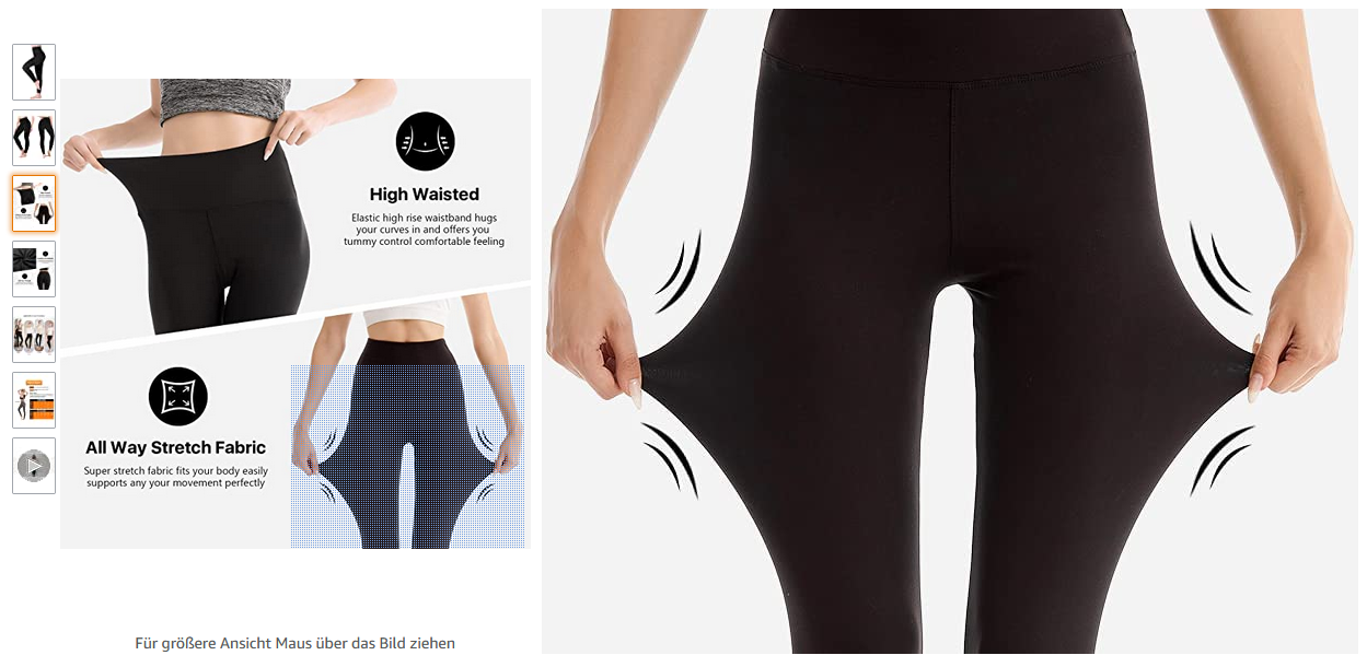
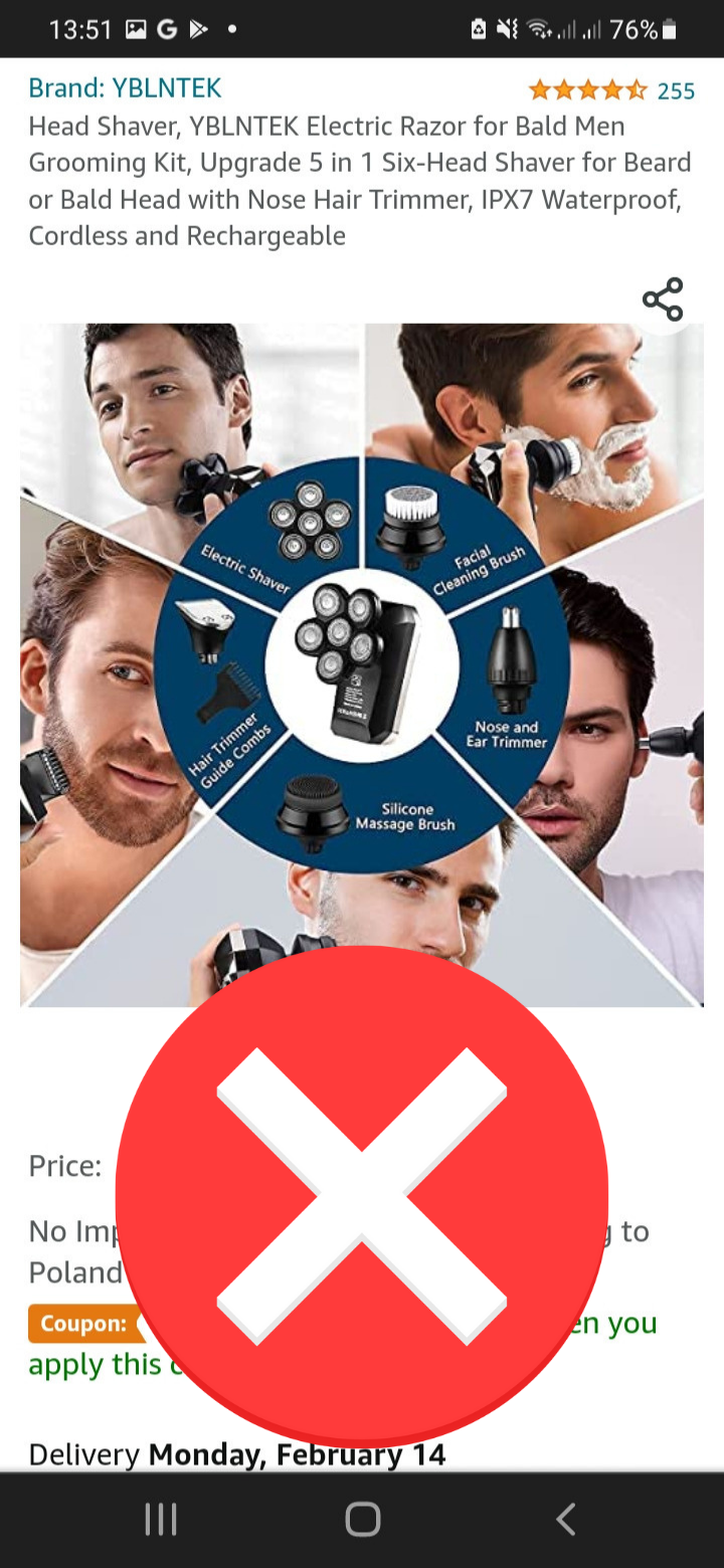
Tip 6 Use icons
The space in your photo is limited, and you want to convey a lot. Therefore, a better method than adding text may be to use an icon that illustrates a feature.
Not in all cases will an icon easily represent a feature, but some symbols are recognisable enough to be used successfully.

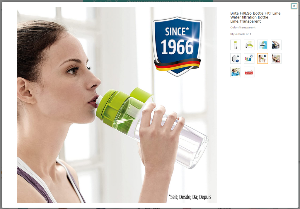
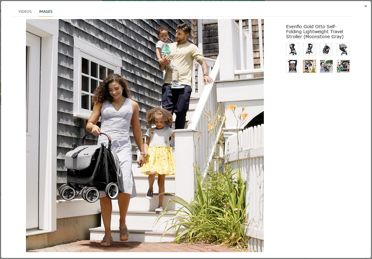
Tip 7 Show application
In order for the user to imagine a situation in which he uses the product himself, it is a good idea to show him its use. Nothing is more appealing to the imagination than seeing happy users of a product.

Tip 8 Move the user
Make your offer more dynamic and move the user. Show movement.
Tip 9 Be mobile friendly
The last but very important advice.
As recent publications show, the future of online shopping is not doomed to mobile.
The fact is that mobile devices have a huge impact on the shopping process. Therefore, when preparing alternative product images for eBay or Amazon, remember that they can be displayed on a small phone screen or a slightly larger tablet screen.
If you place any additional elements (text, logos, pictograms) or want to show a detail in the photo, remember to keep the right proportions, adjust their size, keep proper spacing and margins.
It is better to use a larger font, so that the user can read it, than to add a lot of text in small print that is hardly legible.
If you want to draw attention to a less visible detail, a feature of the product, use such an enlargement that the user can see what you mean.

Summary
Follow our advice and squeeze as much as you can out of your product images for eBay or Amazon. But make sure you do it right.
Don’t forget that the user may be browsing on his phone first. Show them your product to the best of your ability, bearing in mind that they are viewing it on a small screen.
Although, as words of wisdom say, “a picture says more than 1000 words”, do not forget to take care of the quality of the other elements of the listing, such as the description. After first seeing the photos, the user will surely start looking for information in the description.
If you want to make your listing stand out and look more professional, you can always use our templates. Create an account and test it for free.