Why is the company logo so important?
So, you want to start an online shop, or maybe you’re already active on eBay. You’ve sold some items, perhaps even created an eBay template for your listings.
But you’ve realized that something crucial is missing from your brand image – the logo. This is a crucial element when building a brand’s image. The logo ultimately becomes associated with the company. It’s everywhere – on the website, invoices, business cards, flyers, and even on social media platforms like Facebook and Twitter. Market research shows that for consumers, the first impression is the most important. The essence of the logo should reflect the unique characteristics of a specific industry and brand. Every value that a company identifies with should be visible in the logo. For example, a marketing agency would want to highlight different values than an insurance company. On the marketplace, we observe an abundance of various types of company logos and graphics, so it’s becoming increasingly important to stand out from the crowd.
What sets apart the logos of the largest companies?
They are simple, timeless, and highly recognizable. Designing a non-complicated logo may seem like an easy task at first, but it’s actually more challenging than it sounds. Creating a striking company logo requires significant effort. The world’s largest manufacturers are well aware of this, which is why famous brand logos are often simplified over time. For example, think of Pepsi, Apple, or Nike. Designing a company logo has become an art form, where the end product is a highly esteemed work of art. A good project must fulfill several criteria: it must be unique and simple, it must represent the company’s character, and it must be easily memorable. Some logo designers adhere to the rule that if it takes longer than 30 seconds to sketch a logo, it’s too complicated. It seems that even the biggest global leaders follow this rule. It’s always a good idea to take the best as an example, so it’s worthwhile to analyze a few logos from the world’s top companies.
Apple
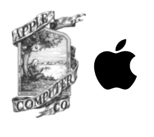
Apple, one of the most recognized brands in the world. The company logo needs no introduction; it speaks for itself. It’s no longer just a graphical design; it’s a lifestyle, a philosophy. As we can see, the logo has evolved significantly over time and has been thankfully simplified. The current logo is monochromatic and straightforward; there’s nothing left to remove, and it doesn’t need any further changes. Importantly, it also reflects the company’s values, such as curiosity, originality, and uniqueness.
Nike, Inc
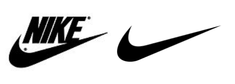
Nike, a US-based company in the sports apparel industry. Everyone knows the logo, whether they are active in sports or not. Can a design be any less complicated? Just a single stroke, but it can’t be confused with any other logo, and legend has it that the design cost $35. It even has its own name – it’s called the “Swoosh.” Despite its simplicity, the logo also represents the company’s character, primarily conveying dynamism and determination. The company name comes from the Greek goddess of victory, and what’s more important for athletes than victory?
Pepsi, Pepsi-Cola
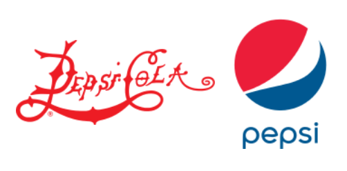
Most of us are familiar with the taste, and the logo remains recognizable as well. When comparing the original logo with the current one, you can see a clear difference. The clear direction here was toward simplification. Even though the text is removed in the current logo, you immediately know what the logotype represents.
Absolute no-gos in logo design
- Too many colors. Use a maximum of 2-3 color shades. The fewer, the better. The logo should be as monochromatic as possible.
- Too many fonts. Your logo doesn’t need more than two fonts.
- Imitation. Existing logo designs should not be copied or modified. Your logo must be unique, right?
- Use of raster graphics. The company logo must always look good, whether it’s small or large. The logo must be scalable without losing quality.
- Wrong color choice. The way customers perceive colors keeps gaining importance in logo design. Therefore, before selecting the color for your logo, do a bit of research on what each color is associated with.
- Designed by an amateur. If you lack graphic design skills, have a company logo created for you. There are several websites on the internet that offer this service.